Celebrating One Year!
9/22/2024

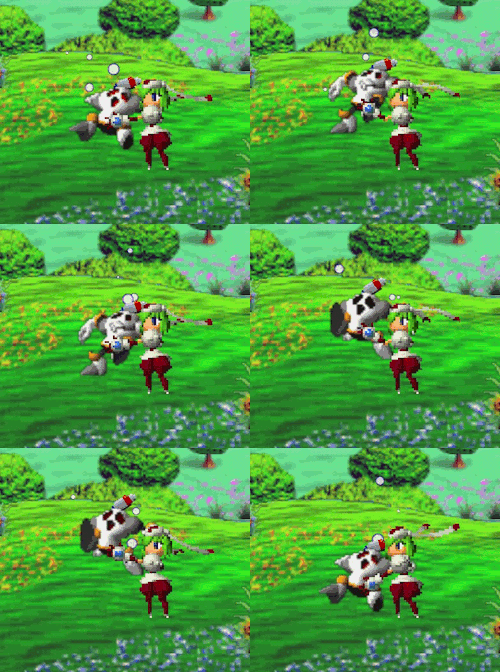
Due to personal reasons of whimsy and fun, I have placed whatever images I wanted into this post.
It's hard to believe, but yes, as of September 20th, this site, Emotion Engine, aka playingps2.xyz has been online for one year.
And what a first year it's been! I've learned so much more than I ever thought I would about web design and coding, both of which I still have an awful lot to learn about! In that first year, I also wrote more than I probably have through most of my life prior...
- 49 articles (this is the 50th!)
- Including two awesome interviews!
- One K-On romance fanfic and two short fantasy-RPG stories.
- 50,000 views!
I can't say that I'm not proud! This has become an extremely fulfilling hobby for me. I've sometimes called it my favorite thing. I have every intent to keep writing, and keep posting. I was occasionally whiffing weekly updates, but for the most part...yeah, I'm doing it! I'm online!
I must thank the netizens of Neocities (where this site is hosted!) who have shown me their fantastic sites and kindly visited my own. You may recall me mentioning a few times, I am all about a human internet, and I admire everyone's weird, quirky, completely personalized corner of the web. You're all working on amazing things, and I, for one, am proud of you!
For my real life friends, online oomfie friends, anyone who let me run my mouth or talk about web stuff or workshop ideas, I owe you all more than I can really put in words.
I want to recap some of the stuff I learned about on the way to one year. After that, in case anyone else is thinking about doing something similar, I'd like to offer some advice and tips!
I Am A Genius

One of my biggest headaches and lessons was the sidebar menu and artwork. I've made no secret (why should I?) that this website began from a template, specifically this one. I thought it would be fun to have something on the sides, colorful images and characters that I could swap out at a whim. Sounds great- and it seemed simple enough. I would simply change whatever image I wanted to have the same referenced filename that's on all the pages. Did you know Slowbro was there before Seraphimon?
This proved impractical. First off, what if the file extension was not the same? For the purpose above, I once renamed a .apng to a .gif and it didn't break anything, but I'm pretty sure that was some kind of freak accident. Second to that, it was quickly getting out of hand having to manually update every page. I eventually discovered the ability to push a whole directory, which helped, but the core issue remained. I was Find And Replacing everything, every time.
The same issue existed for the menu bar. What if I wanted to change a category? Or rename something? I had control over the styling, but not the content. I'm sure some more experienced web people are laughing their butts off right now!
JavaScript ended up being my hero, here. I originally had no intent to learn anything about JavaScript, figuring I just wouldn't need it. Foolish James! What I ended up doing was learning about it and borrowing a bit of code, so that I had more control over everything. Now, a JavaScript file dynamically generates that menu. Your web browser creates it! The code for the sidebar images works the same way. Now, if I need to change anything, I just edit it in the JavaScript file. PLEASE LEARN THIS!
To be honest, I've become extremely impressed with what JavaScript can do for websites. Dynamically generating stuff is super cool. Giving myself a more formal JS education is something on my backburner, I do understand the code that powers it all. I had to implement it, after all. The menu on the Yu Yu Hakusho pages was my latest chance to implement some JS. I was very happy to get that working.
If you've talked to me about the site in the past year, you might remember that for the better part of that timeframe I was really embarrassed with the mobile layout. I would regularly try to touch it up, but I struggled badly with it more often than I didn't. Let me say now that if you don't want to worry about a mobile layout for your site, you really don't have to! A lot of sites here on Neocities in particular don't bother, and that's a fine and wonderful thing for many reasons! A lot of sites are personal coding projects, art pieces themselves, particular experiences...there's no rules when it's YOUR site! For my personal goals, I've always intended to share my posts on my social media, where most people would probably be checking things out on their phones.
Finding out about browser units was a big step in getting my mobile layout fixed up. Is it great? Probably not, but I would say it's the best that it's ever been. I was doing a lot of things in hard pixel counts, which has its place. With browser units, though, things can scale more nicely to different screen sizes. There's no standard resolution on mobile phone screens, so a twenty or thirty pixel difference can actually mess things up a lot if you're not careful.
The JS navbar code I linked above has code included for a Burger Menu. Not like McDonald's, but a little button that brings up a menu on mobile sites. Were I smart enough, I would have implemented that early on. That's the ideal solution. As it stands now, I don't feel like back-adding that to every page and debugging whatever issues it might have with the site layout. I have a navbar on the top that reclaims all the horizontal space. I'm glad I got that to work out. Again, it's not perfect, but it's functional and readable. And hey, Reader View on browsers like Firefox (I would imagine Chrome has this too, but I have no idea) can serve as a backup for any design slip ups.
Another big thing that helped me smooth things over this year was moving to Visual Studio Code. This is an excellent piece of software, especially once you install the Live Preview extension. The code editor I was using before, Brackets (which I think changed into something called Phoenix Code?), also had Live Preview but it was a bit buggy. No such issues on VSCode. I wish I had started with it!
Tips For You!

When I started the site, I had dabbled a little bit in HTML and CSS in high school of my own accord, but nothing substantial. I mention that because you can do this from scratch too, without any prior knowledge or college classes. Those things probably help, and now I'm interested enough in web design and web stuff in general to wish I had gotten some formal education. I don't look at any site the same anymore!
So, do you think you want your own website? Let's go over what I would say to anyone out there considering it!
I think to get the most fun out of this, you have to enjoy the act of actually creating it and seeing it come to life. There can be a lot of trial and error and Googling involved to try and get something to work the way you want it. And then, ultimately, not that many people are going to read this. So it has to be satisfying for you, first and foremost.
If you're interested in having your editorial ideas spread far and wide, well, the avenue for that now is YouTube. That's gonna take some audio and video editing skills, but hey, you're gonna have to learn something either way, right?
So, Tip Number 1: Set up a good learning environment for yourself.
Get Visual Studio Code and the Live Preview extension. Start with a template, if you'd like. Check out the Neocities learning section! And relax before you publish your website anywhere. Give yourself a chance to learn a thing or two. I'm a big fan of the Mozilla Developer Network (now MDN Webdocs) and good ol' w3 Schools.
Somewhere, I was given advice to "Google anything you have a question about", which I originally thought sounded stupid. Surely that would be an ingredient for frustration. But, it's true! Web design is so well established that even your most weirdly specific question probably has 6 or 7 StackOverflow answers somewhere. It works for me. So, be patient, be curious.
Tip Number 2: Design, design, design again!
This is one I wish I had done more of before going online, although, as you can see it's not like anything bad happened. There was just a lot I didn't know about that could be done, that would now be difficult to implement site-wide. I encourage you to take your time, brainstorm ideas, and look at lots and lots of sites! Like I said earlier, there's no rules, and the sky is your limit when it comes to how things look and operate. It's YOUR site that you have total control of, so use that exciting possibility and get inspired! I've seen so many cool and amazing things on just Neocities that it makes my head spin.
And once you see something cool, and you wonder how it works, try your web browser's development tools! Once you get a basic grip on things, more likely than not, you'll be able to see the HTML and CSS that powers cool features! On both Firefox and Chrome this is done with right click -> Inspect! This is the best feature ever, so get friendly with it! Try it on this site!
If you're really smart, it might be a good idea to draw your layout when you brainstorm. Just open up your image editor of choice and start putting some boxes and scribbles around. Where do you want your navigation to be? Are all your pages going to have the same layout? So on, so forth. Getting something in place and just an idea of where you're going will be a huge huge help in creating it! Remember, just like, anything you think of later might have to be back-added to every page, so take your time and avoid any hassles like that!
Tip Number 3: Don't think of it as coding if you don't want to.
This one will vary from person to person, but for anyone intimidated by the idea of The C Word, don't be! Most of what you'll be doing, at least with static HTML and CSS, is just discovering and adjusting existing parameters.
- margin-left
- float: right
- border: 1px solid dodgerblue
...and so on. Does that seem less scary? I hope it does, because I really don't want any preconceived notion about it being hard to do stopping you from at least trying. Instead, think of the joy of your very own creation, online for everyone to see! Your site will exist even when you go to bed or work. You can work on everything on your own terms.
And remember this! Once you've got something working the way you want, you can reuse it on as many pages as you want. So, you can focus on content and stuff whenever things are relatively settled for you!
You're free to ask me for some help any time, but if you don't see it on this site, I might not know about it! There's always something to learn and mess with.
Discovering the fun of doing this has been an enormous joy. I only hope that you've got that same joy somewhere!
Thank you to everyone who helped make this a great first year for playingps2.xyz!
- Webmaster James